Matplotlib: Data Visualisation on Fingertips (Part II)
Introduction
In the last part of this matplotlib series you have introduced with Matplotlib library. You have answered the questions such as What is matplotlib, Why Matplotlib and How to use matplotlib. You have also seen its working with a small example. Let's move forward and learn more in this section.
What are the Parts of a Plot?

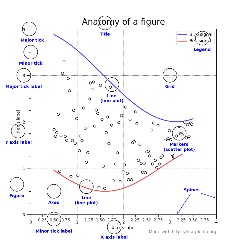
A matplotlib plot have different small parts in it. Let's look at these small parts and learn about them.
- Figure: The whole plot is figure or you can use plot and figure interchangably. The Figure keeps track of all the child Axes, a group of 'special' Artists (titles, figure legends, colorbars, etc), and even nested subfigures.
- Axes: An Axes is basically the plotting region inside Figure. It usually includes two (or three in the case of 3D plots) Axis objects (be aware of the difference between Axes and Axis) that provide ticks (the mark on the Axis) and tick labels to provide scales for the data in the Axes.
- Axis: These objects set the scale and limits and generate ticks (the marks on the Axis) and ticklabels (strings labeling the ticks). The location of the ticks is determined by a Locator object and the ticklabel strings are formatted by a Formatter. The combination of the correct Locator and Formatter gives very fine control over the tick locations and labels.
- Title: The title is a text label that provides a description or summary of the entire plot. Placed usually at the top of the figure, the title provides context and helps the viewer understand the purpose of the visualisation.
- Legend: A legend is the key that explains the meaning of different elements in the plot. When multiple plot elements are present, a legend helps the user to distinguish between those different plots. It often contain labels corresponding to different lines, markers or colours used in it.
- Grid: The grid consists of horizontal and vertical lines that aid in reading the values of data points on the plot. Grid lines can be customized to appear at specific intervals and can enhance the readability of the plot.
- Data Series: The actual representation of data on the plot, such as lines, markers, bars, or other graphical elements, constitutes the data series. These elements visually convey the relationships, trends, or patterns present in the underlying dataset.
These are the main parts of a plot which makes the plot more readable, clear and pretty to the users. Besides these there are many other small parts of the plot.
How to create plot using matplotlib?
Matplotlib or any other data visualisation library provide a wide variety of plots. We can create plots based on single data series such as Histplot, Boxplot etc. You can create plots using two data points or two dimension data e.g. Scatter plot, Bar plot and then you can also create three dimension plots too. So what are we waiting for? Let's start plotting.
HIstplot or Histogram
1# Importing needed library
2import numpy as np
3import matplotlib.pyplot as plt
4
5# Creating data using numpy
6np.random.seed(10)
7data = np.random.normal(0,2,100)
8
9# Plotting histogram.
10plt.hist(x)
11
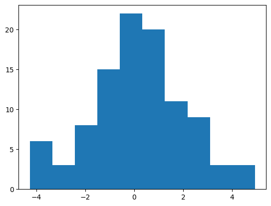
See how much easy it is. Just importing the library and a single line of code. That's all and you have created your first plot using matplotlib.pyplot.
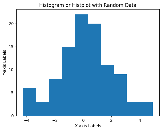
But wait isn't this plot lacking something. Yeah, it has no title, can't even tell what are we plotting or what the axis are denoting. So let's give the plot a little makeover.
1# Importing libraries
2import numpy as np
3import matplotlib.pyplot as plt
4
5# Creating data using numpy
6np.random.seed(10)
7data = np.random.normal(0,2,100)
8
9# Plotting histplot
10plt.hist(data)
11
12# Adding title, X, and Y labels
13plt.title('Histogram or Histplot with Random Data')
14plt.xlabel('X-axis Label')
15plt.ylabel('Y-axis Label')
See now the plot looks much better than before.
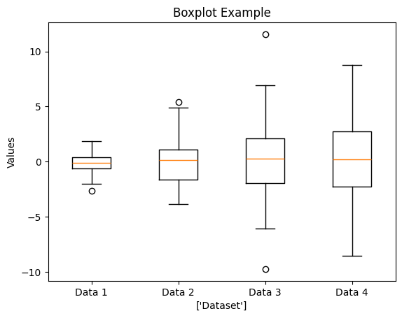
Boxplot
1# Importing Libraries
2import numpy as np
3import matplotlib.pyplot as plt
4
5# Creating data using numpy
6np.random.seed(42)
7data = [np.random.normal(0, val, 100) for val in range(1,5)]
8
9# Plot the data
10plt.boxplot(data, labels=['Data 1', 'Data 2', 'Data 3', 'Data 4'])
11plt.title('Boxplot Example')
12plt.xlabel('Datasets')
13plt.ylabel('Values')
Conclusion
This part works as eye-opener for anyone who think a plot is just a plot. No a plot is combination of many small sections and together they work as a plot. We have basically just covered two plot but they have cleared that how easy plotting with matplotlib can be.
Let's enjoy plotting in the next plot. Stay Tuned.
Thanks.